

PULMONIS
Addressing the common struggle of managing both asthma and allergies by offering a centralized platform.
Many people with asthma also suffer from allergies and struggle to find the information they need to live a normal life during allergy season. Most, if not all, end up using multiple apps and media each day to gather the necessary information. Designing an app that provides allergic asthma sufferers like myself with a comprehensive solution was both important and personal.
Role
This is a concept project where I assumed the following roles:
User Experience (UX) Designer
User Interface (UI) Designer
Deliverables
Interaction Design:
High-fidelity interactive prototypes for key tasks on iOS
UX/UI Design:
Competitive analysis
User surveys and one-on-one interviews
Personas
User journeys and task flows
Site map
Low-fidelity wireframes
High-fidelity mockups and prototypes
Usability tests and findings
Project Specifications
Duration: 6 weeks
Tools:
XD
Balsamiq
Miro
Photoshop
Illustrator.
Overview
PULMONIS is a user-friendly mobile application designed to empower individuals with allergic asthma to effectively manage their symptoms, stay informed about daily allergen forecasts, and conveniently track their condition on one centralized platform. This innovative app provides a holistic approach to asthma care, offering features such as symptom recording, personalized insights, and real-time updates on environmental triggers.
By addressing the common struggle of managing both asthma and allergies, Pulmonis aims to save time and reduce stress for users, providing a realistic and convenient solution to efficiently manage symptoms in one accessible space. With PULMONIS, individuals with allergic asthma can take control of their condition, better understand their triggers, and proactively manage their symptoms for improved quality of life and long-term health outcomes.
Problems
Multiple apps are needed to get the information to start the day.
No real understanding of what information people with allergic
asthma need to start their day.Too much time is dedicated to finding
the specific forecast that affects my symptoms.Constant frustration.
Proposed Solutions
Pull together the information needed to manage allergic asthma symptoms in one place.
Use account data to provide a product that users will find useful.
Research
I focused my research on the competitive landscape to gain insights into how other applications are tackling similar challenges. Analyzing over 25 user survey responses allowed me to quantify the features customers find valuable and the issues they aim to address. Additionally, conducting one-on-one interviews provided a deeper understanding of users' experiences and the specific pain points the app should aim to resolve.
Findings
Concerns ranged from a simple lack of understanding (“I don’t know what I’m looking at. I have no clue what these numbers mean.”) to a strong desire for better management (“Why is it, in this day and age, that I need multiple apps to help manage my asthma and allergy symptoms?”).
Finding the right information in one place would help me manage and navigate my symptoms.
No direct competition in the asthma/allergen arena exists, but there have been several attempts to provide guidance, such as pollen counts or air quality information.
Users averaged three different apps to help them navigate their allergies and asthma during allergy season and expressed a high level of frustration with having to switch from app to app.

User Centered Design
Defining Key Differences in Motivations Through Personas
Superficially, it might seem that everyone is interested in the same thing: knowing about the pollen or the weather. However, upon closer inspection, the user research made it clear that there were divergent motivations.
Creating personas helped bring clarity to those divergences, which would become important reference points as functions developed.

Exploring Common Tasks in
Order to Heighten User Empathy
By mapping the user journey of our persona and examining typical tasks, we uncovered key emotional and procedural pain points that PULMONIS needed to address. For instance, users might feel anxiety if they don’t receive accurate allergy forecasts or frustration from having to navigate multiple apps just to gather the necessary information to start their day.

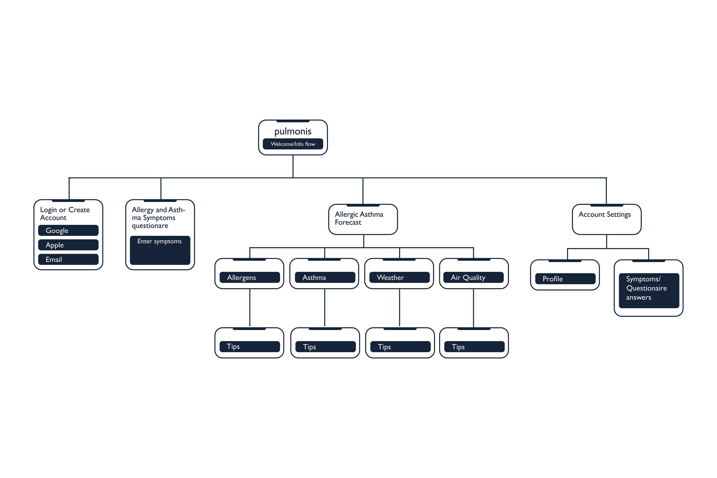
Creating Structure
The site map, informed by surveys and interviews, organizationally depicts the three key task streams that the high-fidelity prototype would focus on.
Visualizing a
User-Centric Experience
Quick sketching enabled me to examine prevalent design patterns in competing apps, aiding in the recognition of elements essential to incorporate into PULMONIS for user familiarity. It also facilitated the identification of versatile screen types and intuitive swiping/touch gestures.

Understanding What Users Find
Intuitive, and Why.
Low-fidelity prototype testing allowed me to better understand how users would complete specific tasks. By closely studying participants' touch and swipe gestures—having a meaningful dialogue with them about their expectations, pain points, and when they encountered difficulties—I was
able to make the necessary adjustments to lay the foundation for a more polished high-fidelity prototype. From refining actionable and cohesive iconography to ensuring consistent navigation paths, every minute detail emerged as a cornerstone of the design system.
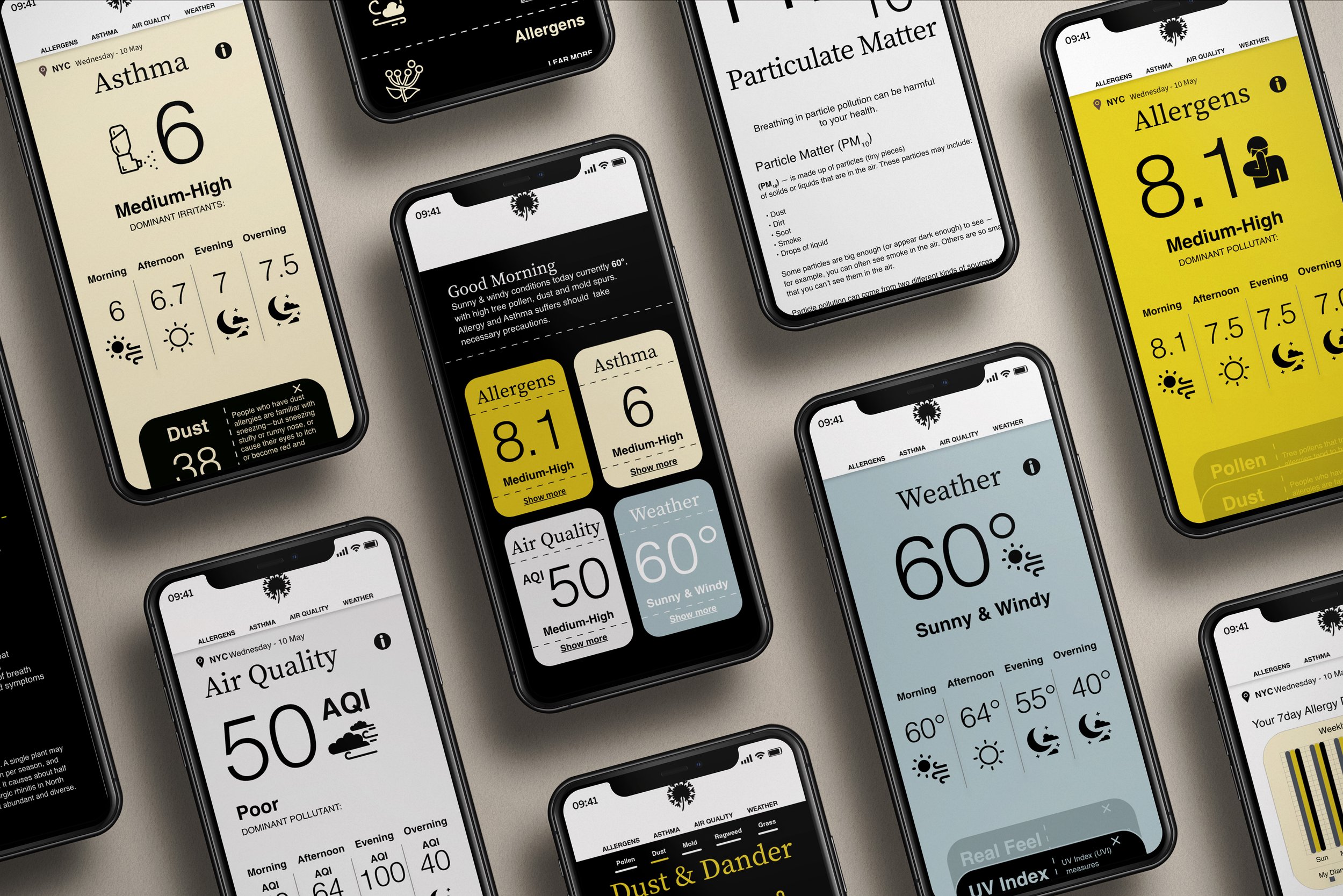
Sample low-fidelity screens depict onboarding, allergic asthma forecasts, management, and information.


Understanding What Works and What Doesn’t.
The high-fidelity prototype allowed me to test the key user tasks I identified in my research. The full application of the UI revealed that while the tasks remained relatively straightforward, some elements warranted reconsideration. Many test subjects, for example, reacted positively to the overall design; some, however, would prefer shorter page lengths and
less scrolling.
Unforeseen Issues
HIGH-FIDELITY PROTOTYPE COPY AND IMAGERY TO COME
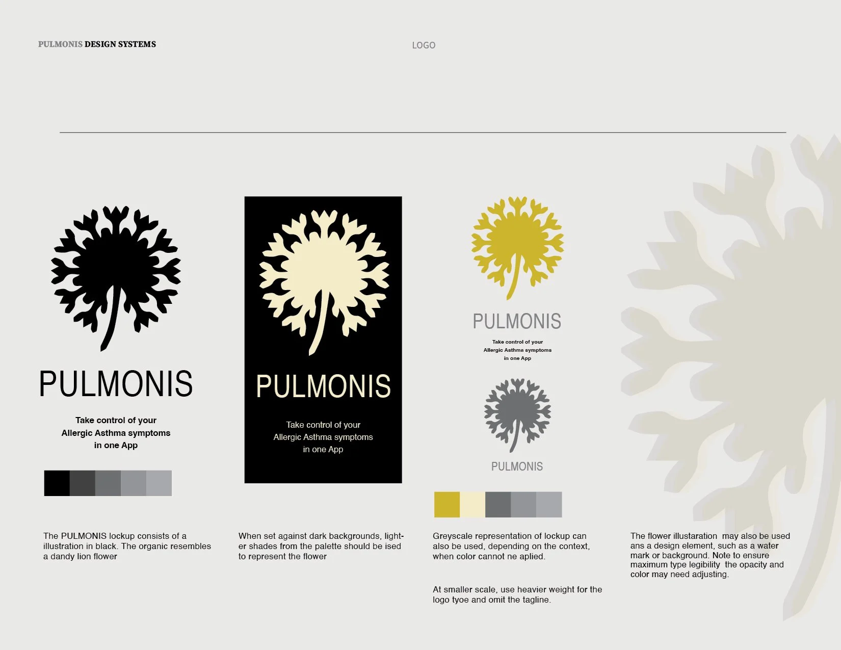
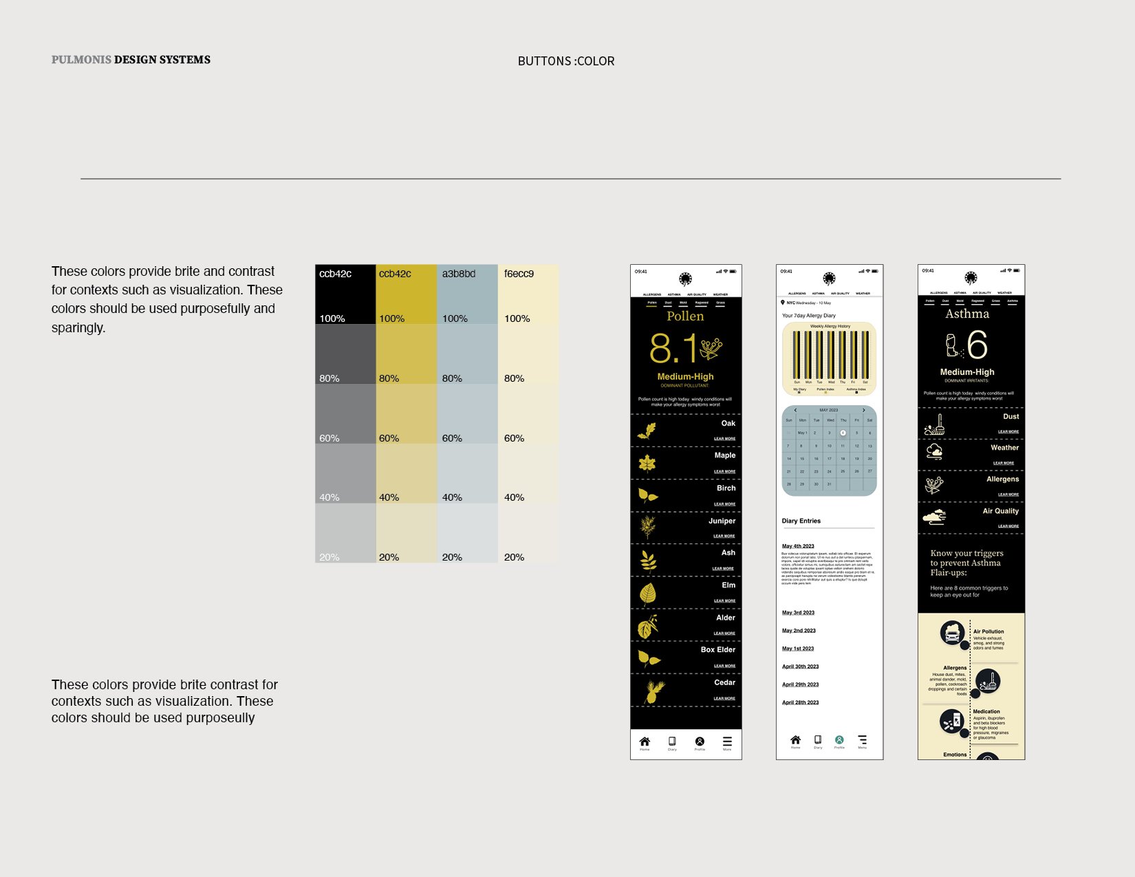
Establishing Visual Design
Visually articulating all potential aspects of the PULMONIS brand (product, marketing, and beyond) meant defining a baseline design system that identified key elements of its visual vocabulary. I wanted PULMONIS’s visual design to always refer back to its core mission: helping allergy and asthma sufferers manage their symptoms in one place.
The primary colors used in the PULMONIS app were chosen for the positive benefits they offer to the user. They are calming and soothing, give hope, and convey optimism. Simple button states and clear iconography help make tasks feel more manageable, while a modern sans-serif and serif typeface with large, open counters ensured legibility and clarity in messaging.


How Usability Might Be Improved.
Issues to Address for Longer-Term Development
More advanced filtering functions to fine tune allergy forecast.
Greater data visualization to aid in allergen and Asthma forecast.
Prompts to encourage providing data that would improve functionality (e.g., “Please rate the accuracy of forecasts provided in the past week.”)
initially, I approached this project with the assumption that the app would solely offer a daily forecast for allergic asthma. However, I soon realized the importance of providing users with information about triggers and additional factors such as pollution, mold, and weather. Looking ahead, I know that the PULMONIS app can evolve and expand its scope to include medication management, emergency assistance, and educational resources such as videos and articles from experts.
Lessons Learned
Sharing sensitive information, such as medical history, sparked suspicion among users. The app's promise to reduce stress added to their doubts. To address these concerns, the app must include reassuring copy on key screens, along with explanations and a support contact option.